
An open letter to OPSEU’s Presidential candidates
Next weekend, OPSEU/SEFPO members from across the province will converge in Toronto for the union’s annual convention. Three candidates are running for the union’s presidency: incumbent JP Hornick, Sara Labelle, and Melissa Shaw. It is to these three candidates that I address this letter.
At the last Convention, attendees were provided a summary of the 2024 Social Mapping Project’s (SMP) key takeaways. As I’ve watched this year’s presidential campaigns play out, I’ve thought a lot about the SMP’s findings. Now, heading into the final week of campaigning, I can’t help but wonder: did candidates for OPSEU’s highest office miss that presentation? Because much of the campaigning I’ve seen doesn’t seem to recognize or care that more than a quarter of OPSEU members are disabled.
If you aren’t disabled, you may wonder why this is a sticking point for me. I have provided a backgrounder to offer some context.
Accessibility on the campaign trail
Key aspects of campaign materials impact the accessibility of materials produced. The brand attributes that largely determine if a campaign’s materials will meet accessibility minimums include:
Typeface. The accessibility of a typeface is determined by its legibility, contrast, simplicity, and spacing.
Colour palette. Normal text must have a contrast of at least 4.5:1, large text (>18 pts or 14 pts bolded) and adjacent colours in non-text content should have a 3:1 contrast.
Typesetting. Text should include a clear hierarchy both visually and in html. Line spacing should be a minimum of 1.5 times the text height. Text should be aligned left. Underlining should only be used for hyperlinks and italics should be avoided.
Let’s see how the campaigns stacked up
To assess the accessibility of campaign materials, I downloaded content from each campaign, identified the HEX codes for the main colour palette and determined the contrast values for each possible colour combination.
Sara’s brand
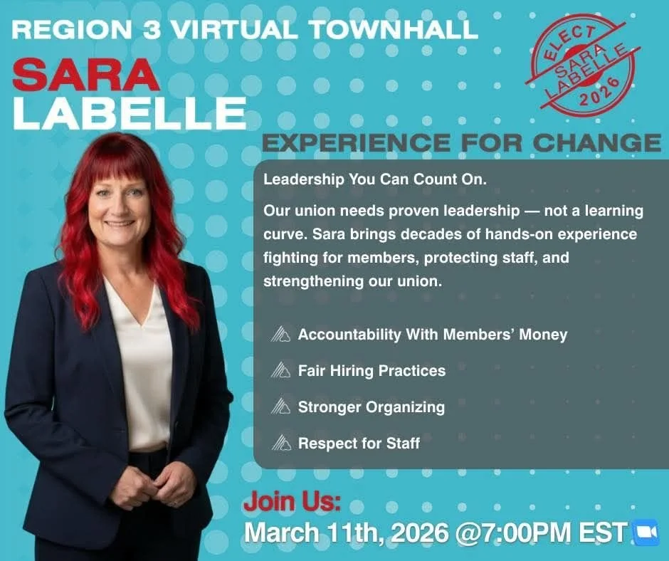
Sara’s campaign uses a palette of teal, red, grey, blue, and white. Of the ten possible colour combinations that can be made using Sara’s palette, only one meets contrast minimums for text (red on white, 5.69:1). The teal on white (3.99:1) that Sara uses on her website fails to meet contrast requirements, as do the red on blue (2.42:1), white on grey (3.25:1), and white on blue (1.7:1) in the image included here.
This promotional image for Sara’s townhall is a great example of what happens without hierarchy in text, as text changes size and colour multiple times. The case is inconsistent throughout, starting in all caps, switching to title case, then sentence case, before returning to title case.
The low contrast (1.38:1) between the blue and grey backdrops, with the added visual clutter of transparency in the grey section overlapping a patterned background create an image that is remarkable as a feat of illegibility.
For someone who has based her campaign on the union not being able to weather a president’s learning curve, Sara certainly seems to be on one when it comes to accessibility standards that have existed for 26 years.
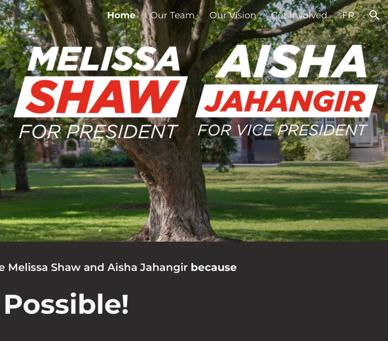
Melissa’s brand
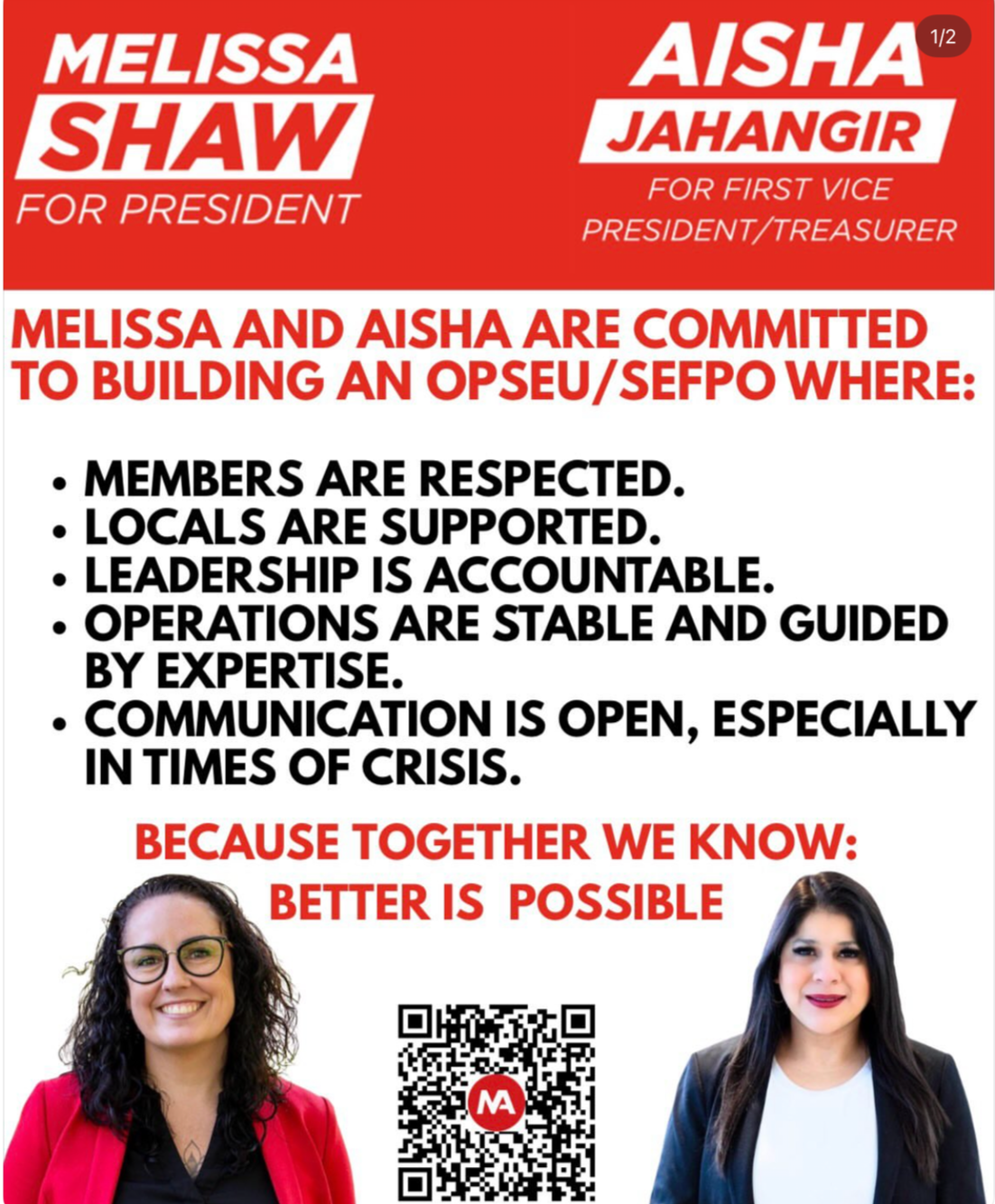
When it comes to Melissa’s campaign, the colour palette is much cleaner. The red and white combination exactly meets contrast minimums (4.5:1).
The potential for accessibility is unfortunately lost when it comes to typesetting and layout choices. Again, there is a lack of hierarchy to this post as all text below the header is both in all caps and bolded.
In addition to the problems caused by all text in all caps, there is insufficient spacing between lines of text in the same paragraph and between sections.
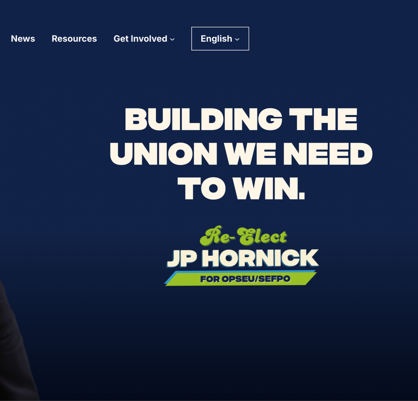
JP’s brand
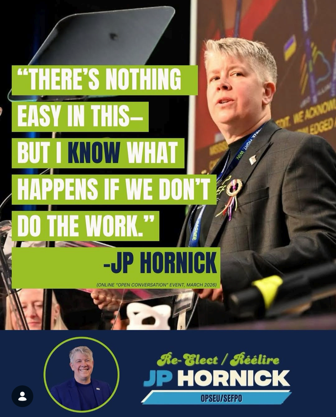
JP’s campaign uses a primary palette of four colours: dark blue, light blue, lime green, and white. Of the six possible colour combinations this palette can make, half exceed contrast minimums. Combinations of the green, light blue, and/or white fall below thresholds, with contrasts between 1.46:1 and 2.83:1.
For the most part, JP’s campaign has used the colour combinations that exceed standards. Unfortunately, the pull quote in this post is an example of content that does not meet contrast minimums.
Other areas where this post could improve include resisting the urge to put text in all caps, keeping all text in the main image justified right, and increasing the size of secondary text (i.e., “online open conversation event, March 2026) to meet size minimums. Overall, this post has clear hierarchy and flows from the pull quote to the election plug at the bottom. In terms of design, it is the only post of the three that uses visual hierarchy.
In terms of accessibility measures, JP’s campaign has consistently captioned video content. However, it’s important to note that none of the social media material (Facebook and Instagram) that I reviewed from these three campaigns included either alt text or image descriptions.
Comparing websites
Update: JP’s team reached out to me on April 8 to say that now that the last campaign event is over, the website is 100% compliant (and sent the site's scan). I appreciate everything they've done to get to 100%.
To assess the accessibility of each website, I used IBM Equal Access’s Accessibility Checker. This checker provides a count for the number of errors per page (elements that are not WCAG compliant) and a percentage of elements with no detected violations or items to review.
Sara’s website
Sara created her website using a service called Hostinger, which promotes itself as an AI-powered website builder. Even Hostinger’s own documentation admits that it is not WCAG compliant. So using this platform for a campaign to represent a union in which more than a quarter of members are disabled is certainly a choice.
As previously mentioned, Sara’s decision to use white text on a teal background has resulted in a website that does not meet contrast minimums. Inspecting the code of her website reveals that none of the images have alt text.
Between Sara’s choice of platform and colour palette, it comes as no surprise that this is the least accessible website of the three. On average, only 81.3% of page elements were WCAG compliant. A single page of the website included 28 separate contrast errors.
Melissa’s website
Melissa’s website is hosted by Google. Unlike Hostinger, Google provides guidance on how to build a website that is WCAG compliant.
Unfortunately, key aspects of the site are inaccessible. Most notably, the navigation bar for the site is almost completely invisible as it is white text overtop of an image of a tree.
Once again, this site includes no alt text.
Melissa’s website and brand are great examples of content that is close to being accessible. There is a clear intention to have bold, clean design but it continually misses the mark by not factoring in very basic accessibility principles (such as not putting small white text on top of an image). Overall, an average of 91.5% of elements on Melissa’s website were WCAG compliant.
JP’s website
JP’s website is hosted by Wordpress. While some of JP’s social posts run into trouble with contrast minimums, the site’s colour use is WCAG compliant.
Unlike Sara and Melissa’s websites, JP’s site includes alt text and a video transcript in both French and English.
Where this site stumbles is in its use of plugins.
Looking at the site’s code, I can see that an event calendar plugin is responsible for most of the issues that IBM’s checker is flagging. Unfortunately many of the plugins that make website building faster can compromise the site’s accessibility, and that does seem to be the case here.
But even with plugin-related challenges, JP’s site maintains an average of 96% compliance with WCAG standards.
Top takeaways
You may be thinking, why does a website’s accessibility matter? I think it’s important to remember that AODA and WCAG are minimum requirements, not the gold standard. These are the basic ways that an organization can commit to accessibility.
The lack of concern to meet accessibility minimums does not end with Sara’s campaign materials. I am a member of Region 3, where Sara is an elected leader. A lack of concern for meeting accessibility standards impacts all aspects of how the region operates.
In March, I attended the regional convention as a virtual delegate. Delegates who attended virtually experienced barriers throughout the weekend, including video feed cutting out on Saturday for a full 20 minutes while the meeting continued without us.
Somehow, in 2026, our region still does not offer virtual training opportunities for union members. This means that for me, as a steward in this region, I have not received any training from this union.
Accessibility in campaigning is not just about alt text; it indicates whether or not a candidate is prepared to represent a membership that includes disabled people.
If I had one piece of advice for Melissa and JP, it would be to pay disabled people for their expertise. There are elements of both campaigns that, with slight tweaking, could be made accessible. Accessible design is a skillset, and one that many disabled people have taken the time to develop. We know what design choices—like using sentence case and limiting italics—would supercharge the accessibility of your campaigns. We know the best resources and tools (like accessible colour palette generators) for creating content. But in order for campaigns to be truly accessible, it can’t be an afterthought. Accessibility needs to be integrated from the start.
And if nothing else, please resist the urge to put things in all caps. I understand the want for emphasis. But it cannot come at the cost of clarity.
OPSEU has an accessibility problem
The inaccessibility of campaign materials is not unusual for this union’s engagement strategy (or lack thereof) for disabled members. As a fairly new member of the union, the 2026 Convention will be my third. Late last year, I was reflecting on the many barriers to full Convention participation that disabled members face. In an attempt to support OPSEU improving the accessibility of this event, I reached out to OPSEU staff and members of the Disability Caucus in December 2025. I attached reports that highlighted how Convention materials failed to meet standards set out by the Accessibility for Ontarians with Disabilities Act (AODA) and the Web Content Accessibility Guidelines (WCAG), from which AODA draws extensively.
In my email, I wrote that I was reaching out “to discuss how OPSEU can ensure that the materials for 2026 Convention and all future materials produced for members meet accessibility standards.” In response, OPSEU staff told me “We have noted your feedback for the 2025 Convention Documents and will endeavour to improve accessibility for the 2026 Convention material.”
This response demonstrates the general lack of will OPSEU consistently demonstrates when it comes to accessibility. I wasn’t reaching out to request that the Convention venue stock a preferred brand of soda. I was pointing out, as a disabled member, that the documents that delegates rely on to fully participate in Convention violated the AODA.
I would have infinitely more patience for this response if two things were different. First, I could understand this response if it was 2009 or even 2015. The AODA became law 21 years ago and laid out a very forgiving timeline to institute accessibility features. As a disabled OPSEU member, I did my job. I requested an accessible document. This legislation is very clear about what an organization’s responsibility is upon receiving such a request: they are to provide an accessible format.
This brings me to the second thing that obliterated my capacity for patience. When I opened this year’s materials, it was immediately apparent that no extra work had been done to improve accessibility. The lowest hanging fruit—from specifying the documents’ language to aligning text left and maintaining 1.5 spacing throughout—was not addressed.
No, it turns out that despite giving the Convention organizers more than three months warning, the 2026 Convention package has more WCAG errors than 2024 or 2025 (the links in this sentence will take you to pdfs of the WCAG compliance reports for each package).
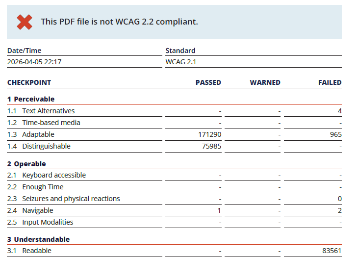
To be specific, the 2026 Resolutions Package has 84,530 accessibility errors. 84,530 reminders that accessibility remains an afterthought, even when legislation requires it.
I am tired of asking for my union to meet the minimum requirements for accessibility.
I am not asking for the world. I am literally asking for the minimum acceptable standard. And I can’t imagine voting for a presidential candidate that doesn’t understand that distinction.